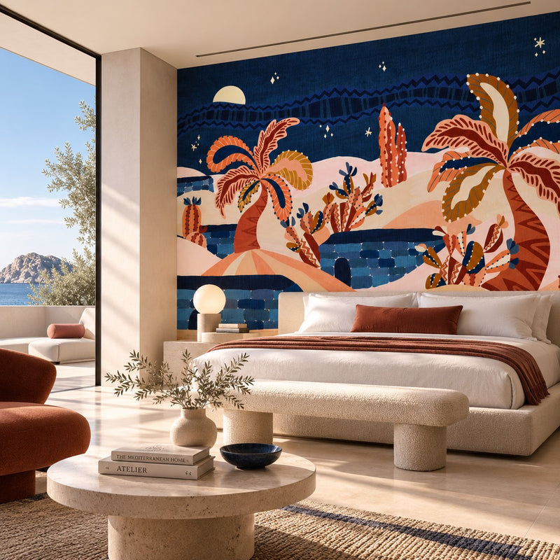
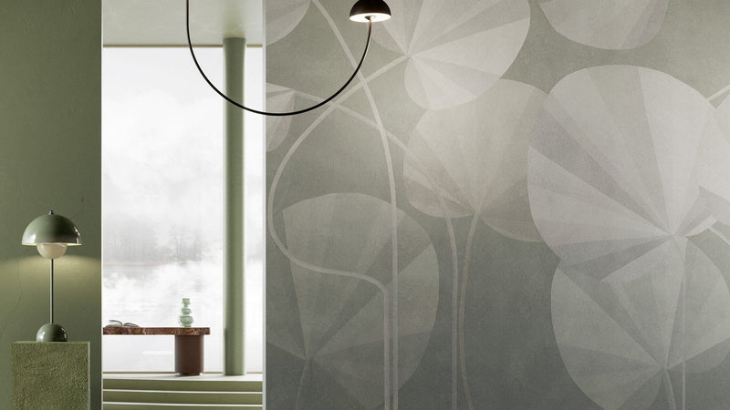
The living room is the space that, more than any other, tells the story of a home. It's the room of connection, of rest, of hospitality — and the wall is the plane these gestures lean on. Choosing a living room wallpaper means choosing the room's underlying tone: how it takes in the light, how it holds furniture and materials together, how it accompanies the people who live in it.
There is no single formula. There are, however, three design criteria that help you get it right: the scale of the pattern, the temperature of the color, the quality of the surface. That's where to start.
The living room as a space of connection
The living room is almost always the largest room in the house, and almost always the most used. That changes how a wall needs to behave: it can't be a statement for its own sake, because you'll look at it every day, in different light, with company or alone.
A living room wallpaper works when it holds up over time. It shouldn't shout at first glance: it should still be interesting at the tenth. That's why the most common mistake — the "catalog wallpaper" effect — comes from thinking of the wall as decoration, rather than as a surface in dialogue with everything else.
Pattern scale: how size changes perception
Scale is the first parameter to consider. A small, repeating motif tends to even out the wall and make it recede: useful when the wallpaper should stay in the background, when the furniture is already strong, when you want a cohesive living room that isn't centered on the wall.
A large motif, on the other hand, brings the wall forward and makes it the protagonist. It works when the living room has good proportions, generous ceilings, and furniture that can hold a dialogue without competing. A middle path — medium rhythms, continuous patterns, broad textures — is often the most balanced choice for a home living room.
Color and light: choosing the temperature of the room
The color of a wallpaper isn't judged on the sample, but in the room. It shifts with the orientation, with the hours of the day, with artificial light in the evening. A north-facing living room calls for warmer tones so it doesn't feel cold; a south-facing one can carry cooler or deeper palettes without feeling heavy.
It's worth starting from the color of the fixed pieces — sofa, bookcase, wood floor — and choosing a wallpaper that relates to at least one of them, even by contrast. The wall doesn't need to match everything: it needs to find a point of agreement.
Surface and matter: the tactile rhythm of the wall
A wallpaper isn't just an image: it's a surface. The way it reflects light, its relief, the texture you perceive even from a distance — all of this builds the material presence of the wall. In a living room, where the light changes a lot, a textured surface always works better than a flat print: it feels more alive, gives back depth, builds an atmosphere that's less two-dimensional.
This leads to a useful distinction: some wallpapers work as an image, others work as matter. Both are legitimate, but very different in the final effect.
Seven directions for the living room
To find your way, it helps to read the Murals catalog through its families. Each one answers a different design intention.
Soft botanicals
When the living room needs calm without turning neutral, a botanical presence works well. Botany brings a lightly drawn botanical: leaves and organic rhythms that soften the wall without saturating it. It sits well on one of the long walls, alongside natural materials — light wood, linen, matte ceramics.
Scenic depth
To open up the space visually, a landscape expands how the living room is perceived. Timeless Panorama works on exactly this logic: a wide scene that acts like a window, able to build depth even in smaller rooms. Ideal behind the sofa, where it becomes the horizon of the whole composition.

Narrative presence
Sometimes the wall asks for a detail that tells a story. Fauna, when handled with elegance, introduces a narrative without becoming illustrative. Chinese Swans brings a rarefied animal presence into the living room, balancing Eastern drawing with contemporary composition: a choice that works in more sophisticated spaces, where the wallpaper becomes almost an artwork.
Graphic rhythm
For a living room with character that doesn't weigh down the reading of the room, a graphic pattern is the answer. Scallop works on a soft repeating rhythm — a cadence that organizes the wall without dominating it. It pairs well with clean-lined furniture and controlled palettes.
Abstract atmosphere
Abstract is the right direction when you want tone without figurative content. Flow offers an atmosphere made of color fields and gestures, where there's no subject to read but a temperature to feel. It works very well in contemporary living rooms where the furniture already speaks, and the wall needs to support without interfering.
Three-dimensional matter
When the wall needs physical presence, a three-dimensional surface is the most radical choice. Flute works on a vertical fluting that builds an architectural rhythm: light glides over the relief throughout the day, and the living room gains a material quality no flat print can deliver. It's the direction for those who see the wall as part of the architecture, not as decoration — and it ties in well with the language of contemporary wall paneling.

Textile memory
Finally, there's the textile register, which brings warmth and softness to the living room. Twill recalls the weave of fabric, building a surface that naturally relates to curtains, upholstery, and the textiles in the room. A choice that works when you want an enveloping living room, never cold, built through material continuity.
How to choose: a summary
Faced with a wide catalog, the decision gets simpler if you follow an order: first the room, then the surface. Observe the living room at different times of day, understand where the light falls, recognize which furniture will stay and which colors are already there. Only then look at the wallpaper.
The design advice is to work by intention: do you want a wall that opens up, that softens, that gives rhythm, that adds matter, that tells a story? Each of the seven directions above answers one of these questions. The right choice is the one that suits the kind of living room you want to live in, not the one that's "on trend."
A living room wallpaper isn't an accessory. It's the backdrop on which the life of the home rests.
Explore the Murals collection and start from the room you have in mind